Well, here we are 2022! Another year older and another year of learning and growing for Mirage. We are so grateful for where 2021 has taken us in the retractable screen door world.
Since 1997 Mirage has been known for the same logo. We know many of you still love the old logo as it may feel comfortable to you. Mirage has outgrown the old logo and brand image and deserved a refresh.
We did not decide to make a change for the sake of change. We decided that with all the growth and strides Mirage has taken over the years, that we needed to change our logo. This is to reflect the direction of the company and represent a more current brand image.
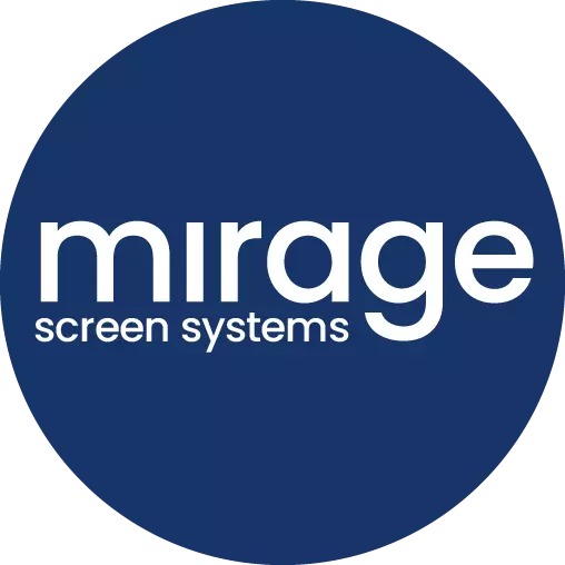
Introducing the fresh look of Mirage!
So why this logo? The new logo represents a friendly, open, and approachable brand. Which Mirage strives to be. The font is more modern and current while also still looking smooth and clean.
The blue logo, which is our main logo, will be used most often. Our other versions will be used interchangeably as needed. The multicolored look brings a playful fun energy to the brand. This is a more modern and exciting fresh look for Mirage.
Over the next few months, you will see all the Mirage visuals, advertising, website, and products reflect the new logo. We are still the same Mirage Screen Systems you know and trust, just with a new refreshed look!